
2019 was a great run for the S&P 500. Its 12-month total return of 31.49% was over three times higher than its 50-year average annualized return of 10.60%.
So how about this year? There are interesting patterns to note.
Shown below is the graph “S&P 500: past 50 years” - it shows the annual returns of the S&P 500 from 1970 through 2019. Highlighted in purple are those years when the calendar-year return eclipsed 30% (shown by the horizontal black line). It’s worth noting that, since 1970, we don’t see two years in a row with a 30% or higher return. In fact, the average return in the year after a 30%-plus return was 13.4%, including two years in which the following year’s return was negative (1981 and 1990).
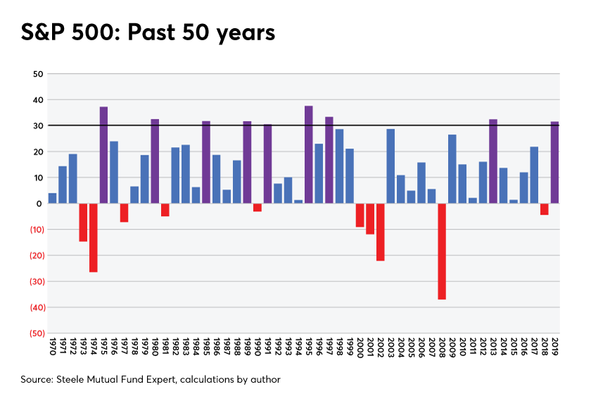
Performance adjusting to normal levels suggests smaller positive returns, as well as negative returns for an equity index such as the S&P 500. As we can see from the 50-year graph, there have been 10 years over the past 50 in which the S&P 500 produced a negative annual return (shown by red-colored bars in the graph). The average return in those 10 years was -14.08%.
What if you construct a 12-index portfolio, what will its performance be compared with S&P 500's performances? We will discuss this in next blogpost.
What if you construct a 12-index portfolio, what will its performance be compared with S&P 500's performances? We will discuss this in next blogpost.
 RSS Feed
