
Q. What is Yield Curve?
A. Basically, the yield curve is a visualization of the interest rates you get from bonds of different durations, from one month up to 30 years.
If everything always worked out logically, the longer-term bonds would yield way more than the shorter-term bonds. After all, you're tying up your money for longer, so you'd expect to earn a higher rate to help offset any risks that may develop while your money is in that bond.
Well, just like stocks, a bond's yield is a function of both the payout and the price -- which fluctuates in the open market. So, in a volatile market, weird things can happen to the yield curve.
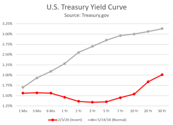
Below you'll see a more normal Treasury yield curve from May 2018 (the gray line), in which yields gradually get larger for longer-term vs. shorter-term Treasury bonds.
However, in the current yield curve (red line), the short-term bonds actually yield MORE than some of the longer-term bonds, including the 10-year:
A. Basically, the yield curve is a visualization of the interest rates you get from bonds of different durations, from one month up to 30 years.
If everything always worked out logically, the longer-term bonds would yield way more than the shorter-term bonds. After all, you're tying up your money for longer, so you'd expect to earn a higher rate to help offset any risks that may develop while your money is in that bond.
Well, just like stocks, a bond's yield is a function of both the payout and the price -- which fluctuates in the open market. So, in a volatile market, weird things can happen to the yield curve.
Below you'll see a more normal Treasury yield curve from May 2018 (the gray line), in which yields gradually get larger for longer-term vs. shorter-term Treasury bonds.
However, in the current yield curve (red line), the short-term bonds actually yield MORE than some of the longer-term bonds, including the 10-year:
What's the implication of an inverted yield curve?
If short-term yields are higher, it's because bond investors fled from short-term to long-term Treasuries -- so they must not be feeling too confident near term.
Also, the banks don't love this scenario. Remember, a bank works by paying interest on your deposits and collecting interest on your loans. Those loans are based on bonds with longer durations -- so when the yield curve inverts, it hurts the big banks' profitability.
Add it all up and, economists say, it's a bad omen.
 RSS Feed
